How to make an experience map
An experience map is a structured customer journey map that we use at Carbon Five to help identify challenges and opportunities within an existing (or imagined) experience. Since we use it so often – both when scoping projects and when kicking off major phases of work – we’d love to share a bit about what makes a great experience map. And because we create them collaboratively with stakeholders, we’ll share our facilitator tips for running an enjoyable experience mapping workshop.
What’s an experience map?
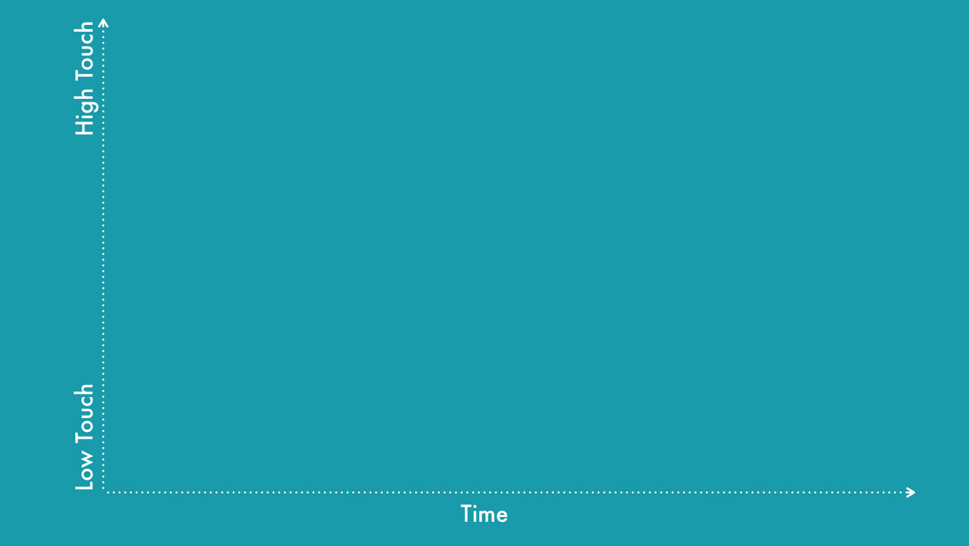
Any diagram that has time on the x-axis can probably be called an experience map. The specific kind of experience map we do at Carbon Five is more accurately called a service blueprint and is traditionally associated with service design. We were first introduced to this style of map by a client, the amazing Tamara Khan. Experience maps look something like this:

Time is along the x-axis, and each box represents a step in a linear experience moving from left to right. The horizontal swimlanes each represent a different actor in the system. The lanes are organized so that the high-touch, physical-world interactions between actors are at the top, and the low-touch, back-office and supporting system interactions at are the bottom.
Often, these maps include other information mapped against the overall experience: things like customer pain points, key steps in a funnel, long delays, or expensive business operations.
Sometimes, two experience maps are used to describe an “as-is” state (the experience as it exists today) and a “to-be” state (an improved experience that you wish to see in the future).
Why make one?
Don’t care why? Skip down to when, who, or how.
Think of the customer journey of an average hotel guest. They get off of their airplane, wrestle their luggage into a car, drive or ride in an unfamiliar city, haul their luggage up to the front desk, wait in line, and finally, it’s their turn to check-in. In the world of customer experience design, this moment is called a brand touchpoint, and it’s crucial to get it right. And at this point in the customer journey, our customer is tired and cranky, a challenging situation for sure. It’s time for our brand to come to the rescue. What do we do?
If we’re DoubleTree, the answer is simple: we give them a cookie.

For those of you who have never stayed at a DoubleTree: when you approach the receptionist, the first thing they do is hand you a warm cookie. In fact, they have special ovens tucked away behind the counter for just this purpose. And if you’ve ever wondered how they came up with the idea, an experience map is a good guess.
Experience maps are effective tools, because:
They’re customer-centric
One of the great things about experience maps is that they put the customer experience at the top. This helps the whole team see the product from the customer’s eyes, promoting empathy and helping shape a desirable product.
They define a product
Getting the team on the same page about the product, and having a single document that captures the whole experience is valuable through a project. Not that drawing a box around a particular solution is an easy thing! It’s not, but it’s a worthwhile exercise, even to discover that you’re not ready to define the product without doing some more research or experimentation.
They can help you scope a project
As consultants, we are often asked to size projects in terms of team strength and durations. But in-house team leads get asked this question all the time as well. We use an experience map as a way to collaboratively assess the number and complexity of desired features, as well as to identify major third-party integration points. Further, we use the resulting map as a conversation-starter around prioritization by turning it into a story map.
Once we have the map and a sense of overall milestones, along with an understanding of stakeholder flexibility regarding prioritization, we can typically give a ballpark estimation for the team size and duration. Plus we have the feature list and rough system architecture.
They reveal ways you can “fake it until you make it”
Once you have your estimate, more often than not you’ll want to make that estimate smaller. While some of the great product ideas in an experience come from streamlining or automating steps in an experience, sometimes you want to get the product to market faster by people-powering features. The experience map lets you play with what actor (be it person or machine) that supports each step in the customer journey.
They identify opportunities for innovation
New solutions to existing problems jump off the page of a good experience map. Take any existing real-world experience (hailing a cab, hiring a babysitter, waiting in line at the DMV, losing your luggage) and map it. Chances are you’ll find pain points that are opportunities for innovation. Then you can define a new experience map based on your product idea and keep on iterating.
When is a good time to make an experience map?
Consider making experience map when:
- Before starting a large (multi-week) project: Experience maps are great at capturing large, detailed experiences, but overkill for short projects
- After customer interviews and creating proto-personas and jobs-to-be-done: You need to know the roles/actors in the system and their overall needs before you create your experience map
- When the experience is known: You should map an existing experience you know well, or a theoretical experience that you have a strong hypothesis for
- When the experience can be described linearly: Hub and spoke experiences, like a social network, are challenging to map as a linear experience (but not impossible!)
- When you have roughly two hours: Set aside two hours for each experience map you plan to make, and don’t try to do the “as-is” and ‘to-be” maps back-to-back
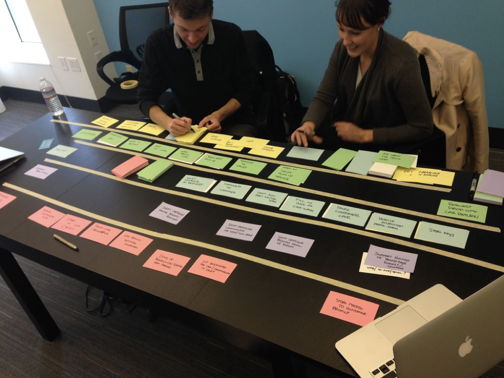
Photo credit: Laci White
Who should be involved?
We like and encourage you to create experience maps as a collaborative activity involving a cross-functional product team. Since we are usually mapping software experiences, our workshops generally include:
- The primary stakeholder or client
- A product manager (often the facilitator for the exercise)
- The lead designer
- The technical lead
- Domain experts (often one for each major actor in the system)
There isn’t a perfect size for the team, and often individuals have overlapping roles, but if you are approaching 10 people in the room, some folks will get bored. Between three and six folks seems ideal, but we tend to err on including extra interested stakeholders, even if it is just for the sake of transparency and consensus-building.
How do you make one?
Creating an experience map is relatively straightforward in theory, but complicated in practice. We’ll lay out the basics and then share some facilitation tips along the way.
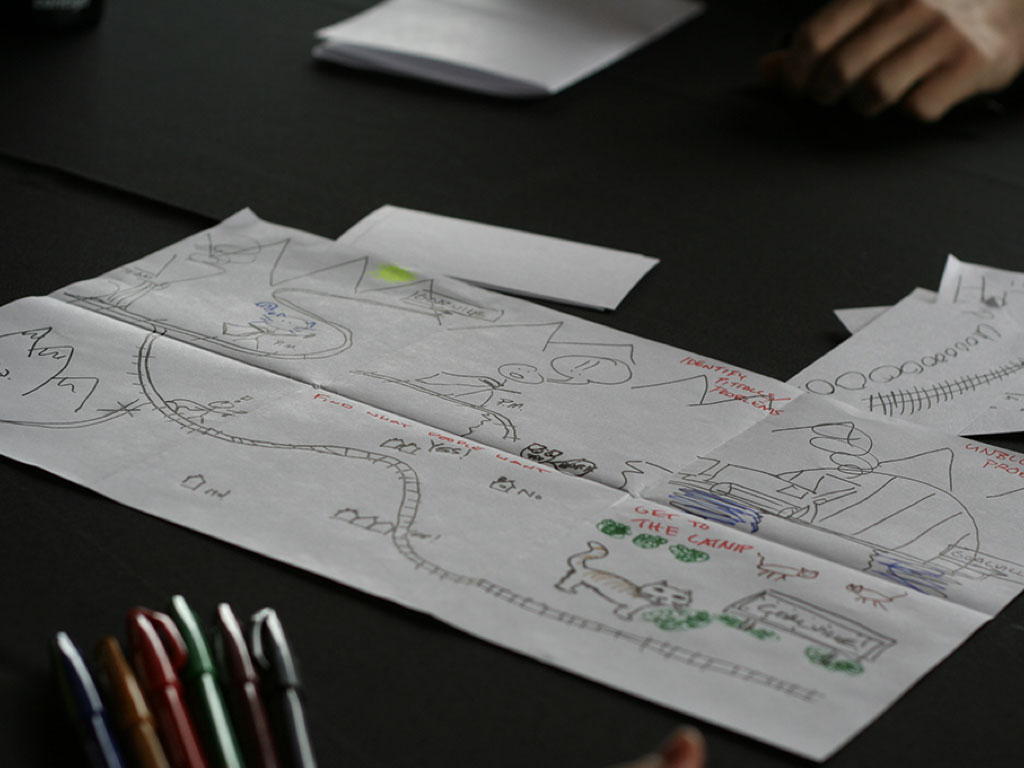
The original experience map for Masterclass
In addition to the cross-functional team you’ve assembled, and the two hours you’ve carved out, you’ll want access to a private space and a large table. You’ll also need:
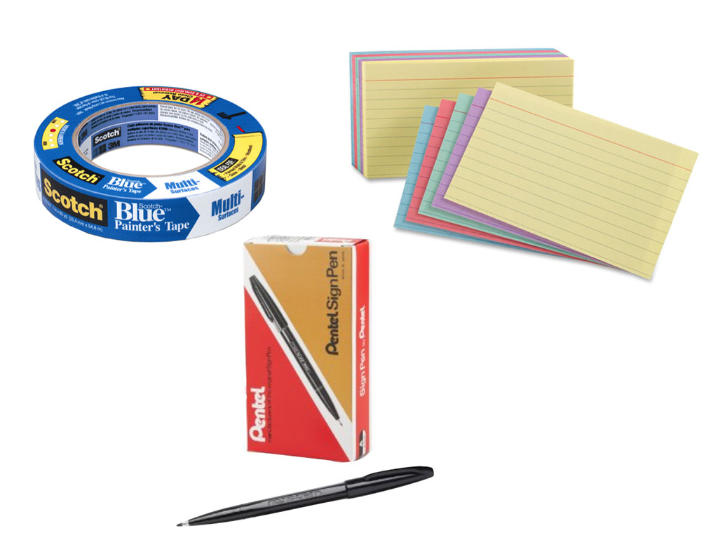
- Stacks of index cards, or sticky notes, in at least five colors
- Sharpie Markers, Pentel Sign Pens, or another medium-thick pen
- Blue painters tape (get the fancy 3M stuff so you don’t ruin the surface)
- Sticker-dots for dot-voting and marking points of interest
Don’t have a large enough space or your entire team in one location? No problem! You can use a virtual tool like Stickies.io to collaborate with remote teams and easily create a digital document to share.
If you can’t find a long table, you can also do the activity on a large wall with sticky notes. We slightly prefer the index-cards-on-table approach since it makes moving cards around easier and is slightly easier to collaborate around. If you do use a table, remove all the chairs from the room or push them against the wall: you’ll want everyone standing around the table.
Just before the workshop starts
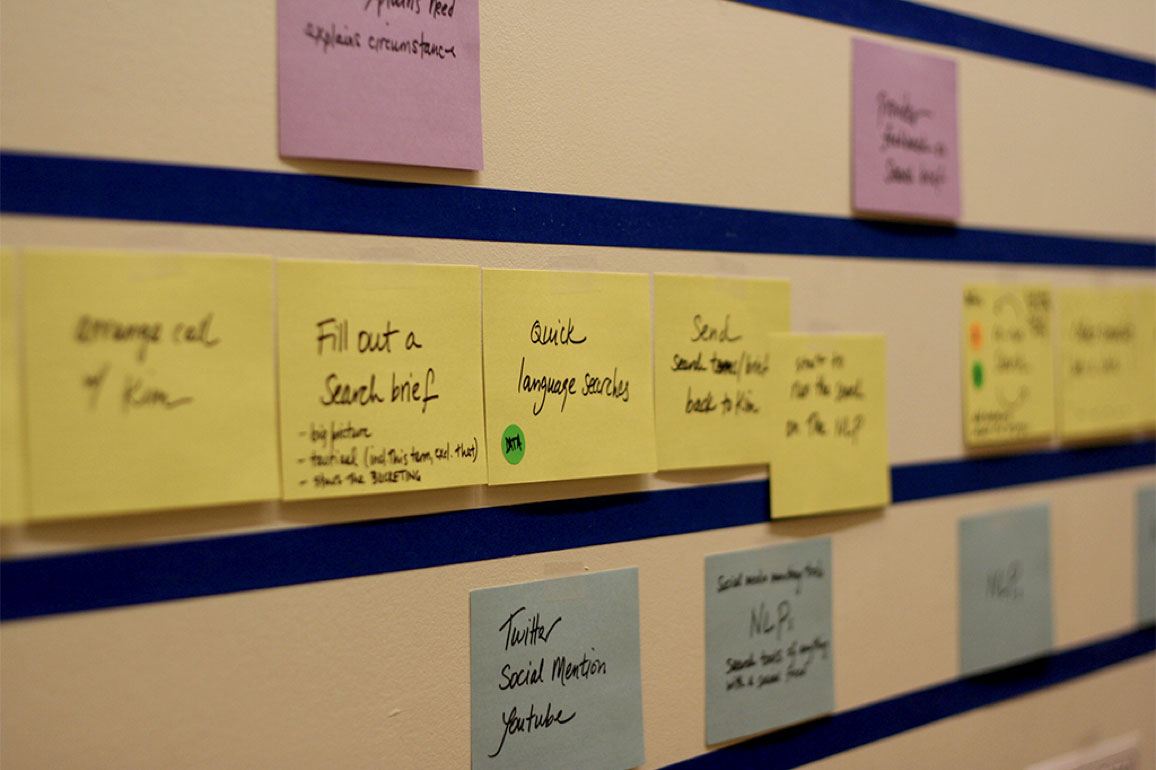
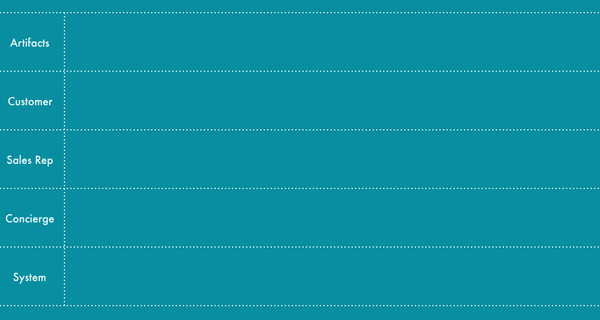
Before the workshop, lay out your swimlanes the long way on the table or wall, one lane per human actor in the system (which you’ve identified these during customer interviews), plus two additional lanes — one at the top and one at the bottom. (We’ll talk about them in a second).
Organize your index cards or sticky notes so that each swimlane gets a different color and label each of the swim lanes with one of the actors. These will be the role names of the actors in the system plus the two extra lanes, the top one labeled “Artifacts” at bottom lane labeled “Software.” For example, if you were creating an experience map for a café, you would have the following cards laid out along the lefthand side, one per swimlane and each in a different color:
- Artifacts*
- Customer
- Cashier
- Barista
- System*
* For those that are well-versed in service blueprints, you’ll notice that we’ve renamed “Physical Evidence” to “Artifacts” and “Support Processes” to “System.” That’s because, at Carbon Five, we are making software. So we like to include virtual things like emails and SMS notifications in the top swimlane (in addition to any physical artifacts), and mostly only interested in software for the bottom swimlane.

Notice that the actors are laid out top-to-bottom so that the actor that interacts with the customer the most (the cashier, in this case) is right below the primary actor. This pattern carries down the chain. A very typical set of swimlanes for a software platform for two-sided marketplace (e.g. Etsy) looks like:
- Artifacts
- Buyer
- Seller
- Admin
- Software
This is true even though the seller experience happens before the buyer one (to get the product into the marketplace). That’s because the buyer is the end customer, and the seller is more likely to interact with back-office actors.
Finally, lay out a piece of tape vertically just to the right of the roles and stack the rest of the cards/stickies and pens in a place that is convenient for multiple people to grab, since you’ll want everyone participating.
The only other thing you might want to prep is to think about where in the overall experience you think the map should begin and end. In our experience, teams can sometimes spiral debating on how far back in time to take the experience map, and it’s always good to have an end target in sight.
A good default is to begin the map right when the main customer is going to use the product for the first time and to end it when they refer the product to a friend. So, for mobile apps, or first card is often “opens app” and for web applications, it’s “visits site.” You can always do another map that dives into how the customer is made aware of the product, finds it, and the like.
Introduce the activity
Gather the group and introduce the activity. If you are facilitating this for the first time, have an especially large team, or if anybody seems confused, you can spend 15 minutes and do the beginning of the café example referenced in this post. This helps orient everyone without the extra mental load of thinking about the actual product under discussion.
Start with the end customer
Beginning with the end customer, create one card for each step in the experience, moving from left to right.
A couple of tips when creating a card:
- When you get to the first place that there is an interaction with another actor, create a card that describes that step from the second actor’s perspective. You can use either the passive voice (“Sign up”) or the active voice (“Signs up”) as long as you’re consistent.
- Keep the action card descriptions fairly high-level, at the “epic” scale if that is something you are familiar with. These will later be broken down into multiple stories.
- We also try to refrain from talking about specific screens or tangible UI components at this stage. This is more about the perceived experience than the actual interface or code that will support it.
- Try and include everyone in the discussion of what card goes next, and let anybody create, place, and shuffle cards around.
If the action you just documented is roughly simultaneous, place it directly below the first actor’s card. Continue the map, moving from left to right, top to bottom (you can stay with one actor for a while, and backfill actions below, or go deep for each step in the flow).
When there is an external triggering action (often an email, an SMS, a physical device, or a printed piece of collateral) for an action, describe it on a card and place it in the “Artifacts” swimlane, above the actor that interacts with the artifact.
Rough in software needs
When you create an action card that interacts with a piece of software instead of another person, add a card that describes the software that is being interacted with in the “System” swimlane. This can be a known, named system (e.g. Salesforce) or an abstract placeholder (e.g. E-mail Service).
When in doubt, just jot something down for a future conversation — the goal of this part of the map is to identify big chunks of software, not to design the domain. It is especially interesting to note which components of the platform touch internal or external services, since these integrations tend to cause estimates to balloon.
Wrapping-up
Continue moving from left to right, top to bottom, taking breaks as needed, until you reach the end state defined up front, or you run out of ideas for cards, or are just plain exhausted. Before wrapping up the map, consider doing a couple of follow-on activities:
Funnel cross-check
Note where different steps of a typical user funnel occur, and fill in missing steps. Look for where in the experience users are acquired, where they have achieved the core value, where monetization occurs, and where (if anywhere) a referral loop happens. These can be your first draft of KPIs, and will help designers identify key points in the experience to optimize.
Annotate big lapses in time & pain points
Take a minute to identify where big gaps of time occur, and mark them with a sticky noting how long of a wait the step typically takes. Also mark where you think major pain points are (or will be) for each actor. These are often areas for ideating potential solutions. You can also annotate your map with pull-quotes from user interviews and usability tests.
Try people-powering features
If you are modeling an existing “as-is” experience and are looking to automate some of it with software, you have already identified some pain points to think about. But if you are creating a “to-be” map, take a moment to think of steps of the experience that you may assume will be automated (e.g. are in the “Software” swimlane) and see if you can people-power those features at launch. You can always write more software later, but you will never get back the time you spend on features nobody really needs.

What’s next?
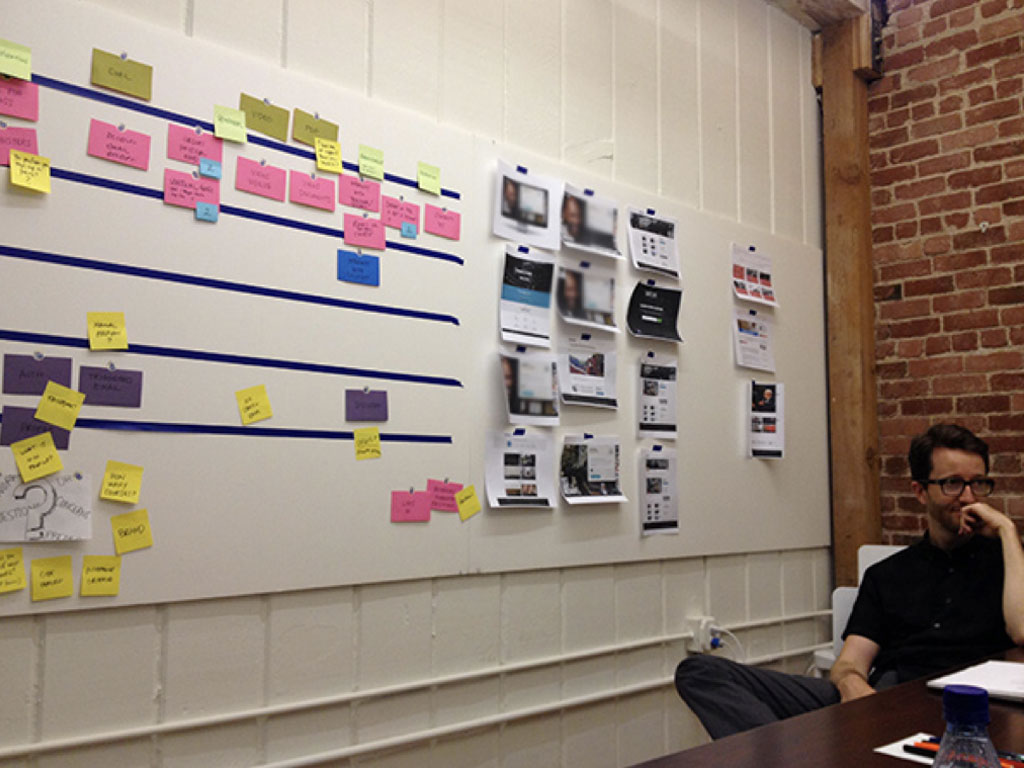
Now that you have your map, you should at least document it and consider transcribing it to a more permanent medium. Better yet, transfer it to a wall near the team. And here are two other interesting things you can do with an experience map:
Ideate pain points
After dot-voting major pain points, turn them into a “How might we?” statement and do some six-up sketches (or its relative, crazy-eights). In this activity, everyone in the group comes up with six different ideas to fix the problem in six minutes. Using this technique, you can come up with a ton of new ideas for the product within the context of the the overall customer experience. These ideas can be prototyped for validation, or prioritized and added to an existing product as an A/B test.
Story map
Another great thing to do with the map is to turn it into a prioritized backlog, along with major milestones. It’s pretty easy: just take each vertical column and staple the cards together. You’ll have what is basically an epic that is told from the primary users perspective.
After you’ve stacked all the cards in each column, you can cluster them into a Jeff Patton-style story map by grouping them into major activity areas, typically categories like onboarding, shopping (or whatever the major experience your application supports), sharing, support, and so on.
Within each cluster, sort the cards in order of priority. Then create a milestone of, say, the top five cards that you think make a cohesive product or interesting user test. Continue prioritizing and grouping cards into a handful of major milestones that can be given ballpark estimates, allocated teams, and put into a roadmap.

Design the user experience
Finally, a completed experience map is a great place to pause for a moment and focus on user experience design. While the map feels like a reasonable picture of a product, a designer will bring another perspective as they create flows & detailed wireframes, build & test prototypes, and design the interaction & visual language. It’s also an excellent time to let your technical lead think about the high-level system architecture, do some domain modeling, and do some technical spikes if needed.

Good luck!
At Carbon Five, we may do 50 experience maps a year, and each one comes out a little differently depending on the team and the product. And we’re constantly on the lookout for new tips and tricks, so please share your experience mapping…er…experiences with us!
David Hendee
David is the Director of Design at Carbon Five. He joined the company in 2004. Before that he was a freelance illustrator and a co-founder of the web development firm Fire Engine Red. David lives in Alameda with his wife Jenny, their dog Daisy, and a tiny dinosaur named Dorothy.