Dyslexia vs Typography
Design has made leaps and bounds to accommodate for all types of visual, auditory, and physical limitations. However, there are some boundaries to what it can accomplish. One example of this boundary where design has not been able to bridge the gap is Dyslexia.
I was diagnosed with Dyslexia and Dysgraphia at the age of eight after three years of struggling through public school curriculum and having teachers say, “You should probably be held back.” It’s an issue that has shaped much of my opinion on design.
Every few months, an article appears in the news about a font that will help people with dyslexia read and “relieve” them of their symptoms; it is frustrating to say the least. What these articles fail to understand is the difference between legibility and accessibility. Let me explain why.
What is Dyslexia?
Dyslexia is a brain-based condition. It causes difficulty with reading, spelling, writing and sometimes speaking. In people with dyslexia, the brain has trouble recognizing or processing certain types of information. This can include matching letter sounds and symbols (such as the letter b making the buh sound) and blending them together to make words.)
Some people with dyslexia don’t have trouble sounding out or ‘decoding’ words. But they may struggle to understand what they read. It can be very hard for people with dyslexia to read in a way that’s automatic, or seemingly without effort.
Dyslexia can create difficulty with other skills, however. These include:
- Reading comprehension
- Spelling
- Writing
- Math
—Understood.org
Lets pull a few key excerpts from the quote above (it’s a little long):
Dyslexia is a brain based condition and it affects the brain’s ability to process information.
Dyslexia has nothing to do with eyesight, or the shape of letters on a page. It is entirely based on how the brain processes information that it receives.
Dyslexia is not always about sounding out or decoding words, but they may struggle to understand what they read.
Some symptoms of Dyslexia don’t always present in the ways you might have heard (i.e letters moving around on a page). It can extend all the way into reading comprehension — which determines if a person understood the words that they just read.
This (Symptoms of Dyslexia) can include matching letter sounds and symbols such as the letter b making the buh sound and blending them together to make words.
Dyslexia can also appear as difficulty in blending sounds together. This again, has nothing to do with the actual letters themselves, but how the brain makes connections from a piece of information (letters) and what they mean (sounds).
From the description provided above, we need to make the distinction that Dyslexia, despite what you may have heard about or seen in movies, is not a condition where letters move around a page. It is the neurological process of connecting a letter with the sound it is supposed to make. This, unfortunately, cannot be solved with a font that has a bigger x-height or better hinting.
Fonts that Aim to Help Dyslexia
There are a few fonts like this out in the wild – some popular ones include Opendyslexic and Dyslexiefont. Through my research, I have read many articles from the designers of these fonts. While I applaud their skills and the effort they’ve put into designing for a user group that is generally under-served, there remain several fundamental problems with these fonts. And now I need to criticize them.
Below is an excerpt from a paragraph from OpenDyslexic’s website:
OpenDyslexic is created to help with some of the symptoms of dyslexia. Letters have heavy weighted bottoms to indicate direction. You are able to quickly figure out which part of the letter is down which aids in recognizing the correct letter, and sometimes helps to keep your brain from rotating them around. Consistently weighted bottoms can also help reinforce the line of text. The unique shapes of each letter can help prevent confusion through flipping and swapping.
Let’s break this down:
OpenDyslexic is created to help with some of the symptoms of dyslexia.
Ok off to a good start, let’s review what we know the symptoms are:
- Trouble decoding words
- Trouble understanding the content behind what they are reading
- Matching sounds to letters and blending those sounds together
Letters have heavy weighted bottoms to indicate direction. You are able to quickly figure out which part of the letter is down which aids in recognizing the correct letter, and sometimes helps to keep your brain from rotating them around.
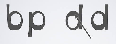
So here is where they miss the mark. These design choices don’t match up with dyslexia’s actual symptoms; rather, they appear to address the symptoms people misconstrue as those of dyslexia. Namely, the notion of words moving around on the page.
The idea of words moving around on the page is used as a metaphor for what it is like to have your brain be disoriented while reading — it’s not really the problem, nor is this symptom described by everyone with dyslexia.
The problem is not the letter forms themselves or what the letters look like, it’s how our brain interprets these symbols into verbal communication. That problem is much deeper.
How We Might Approach This Problem
The case this font is making is a good one, just not for this context. The designer is stating that this font is much more legible than others because it has a heavier weight at the bottom. But legibility is not the culprit behind dyslexia.
It seems like most of the designers behind these fonts are trying to solve the problem by asking: how might we make it easier for people with dyslexia to read? Rather than asking: how might we change the act of reading so that it does not affect people with dyslexia?
It’s simply a different approach. Instead of helping the people who suffer from the disability, why not change the broken system.
Humans are hardwired to communicate verbally, and as makers of tools we realized that only using our voice box to communicate was limiting so we designed a solution, symbol based communication. As we know there are always unintended consequences to our designs some big and some small.
In this case, an unintended consequence is Dyslexia. In lots of cases, the world sees these differences in brain function as just about how people navigate through the world. Think about visual, auditory, and tactile learners.
Let’s be clear, I do not have an end-all be-all solution to how we can change written communication to solve this problem. But I do know that simply making new fonts is not going to help. Design, while one of the most powerful tools humans have created, has limits and I think these examples push up against some of those limits.
As human-centered designers, we must honor and understand our user group and what they are going through.
Additional reading and resources:
- https://www.understood.org/en/learning-attention-issues/child-learning-disabilities/dyslexia/dyslexia-friendly-font
- https://medium.com/boston-university-pr/the-dyslexia-paradox-4d28dc830d3b
- http://dyslexia.yale.edu/research-science/ycdc-research/
- https://dyslexiaida.org/frequently-asked-questions-2/
- https://www.mayoclinic.org/diseases-conditions/dyslexia/symptoms-causes/syc-20353552