Apple’s Built-in iOS 8 Usability Testing Feature

The gateway to a more uniform experience
Hot Tip!
For those of you that make decisions based on hierarchy, composition, and usability (read Designers) Apple gave us a great tool without even knowing it.
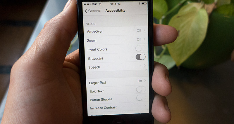
tl;dr: Go to Settings > General > Accessibility > Grayscale: On.
A friend of mine (who isn’t a designer) opted for turning off the color on his phone. He was over all the bright colors, busyness that comes with with it. It took me a few minutes to process that someone would opt out of color. The more I thought about it, the more it made sense and a few added perks started to manifest.
For those that didn’t study design and art, we spent an inordinate amount of time thinking about composition, visual hierarchy and how the user/view would interact with our work. A lot of this comes from stepping back and getting a new perspective on what we’ve done. I time and process tested composition trick was to turn your painting or poster upside down, step back and see how everything sits. Usually a successful piece will work however you spin it. You see the little things, or the gaps, that you couldn’t perceive otherwise. More often than not, others see these weaknesses faster than you (which is frustrating) since they are not as intrenched in the decisions that got you there as you are. Hence the need for critique.
Fast forward… Seeing the iPhone in black and white reminded me of this process of years past. At Carbon Five, we work in a fast paced, iterative environment, and sometimes we don’t have the time to sit back and contemplate the all the small decisions we make when designing our work. It occurred to me that using the Black and White function could come in handy and help me make better and quicker decisions when it comes to these little details.
Turning off color, allows your brain to view composition and visual hierarchy without distractions. This is highly useful when you are working with mobile web and native projects. Your screen size is limited you have much less space and time to get your message across. Making sure that your layout is balanced and follows the basic rules of visual hierarchy is even more crucial, ensuring that your users are seeing what you want them to. Seeing your work slightly out of context like this will make you think about your decisions a little more, and hopefully make you a better designer or developer.
Regardless of if you are a designer or not, its a great experiment. See if you can last a day, or two. I think you’ll like it. Take note of how your favorite apps look. Check out the small details, the feeds, the comments, your home screens, etc. You’ll see patterns in what works, what doesn’t and places for improvements. See if you can make it 24 hours in black and white.
Some Quick Examples:

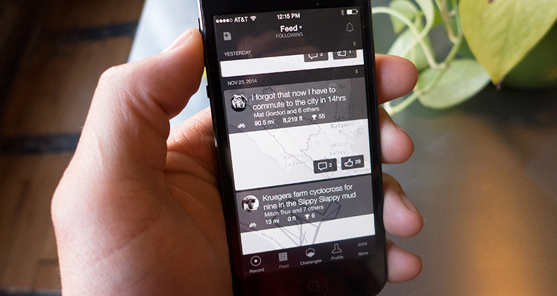
Strava: Friends Feed

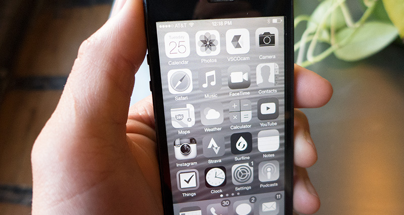
Apple Homescreen: Great way to see if your logo stands out.

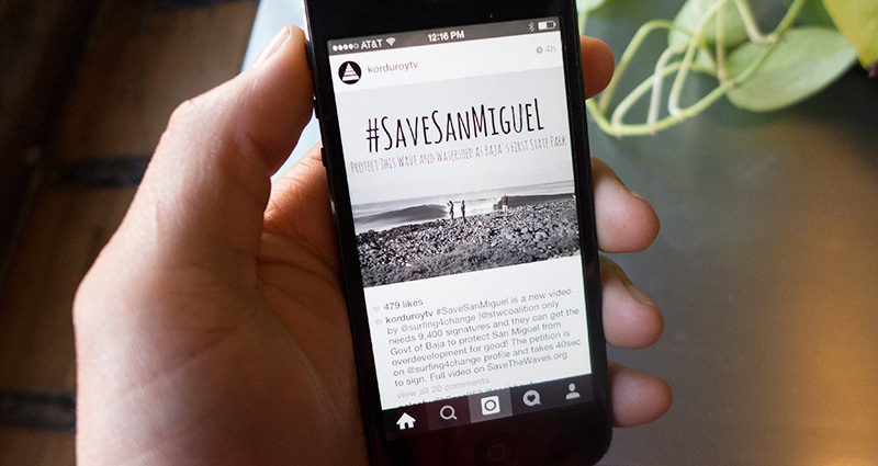
Instagram: Check out the visibility of the comments and users.
Hidden Bonus’ of going Black and White:
-
Its pretty fun.
-
You take better pictures. B&W allows you to see your composition and values better.
-
Instagram becomes slightly less addictive.
-
You spend less time on your phone.