Visualizing Skillsets in HTML5 Canvas: Part 1
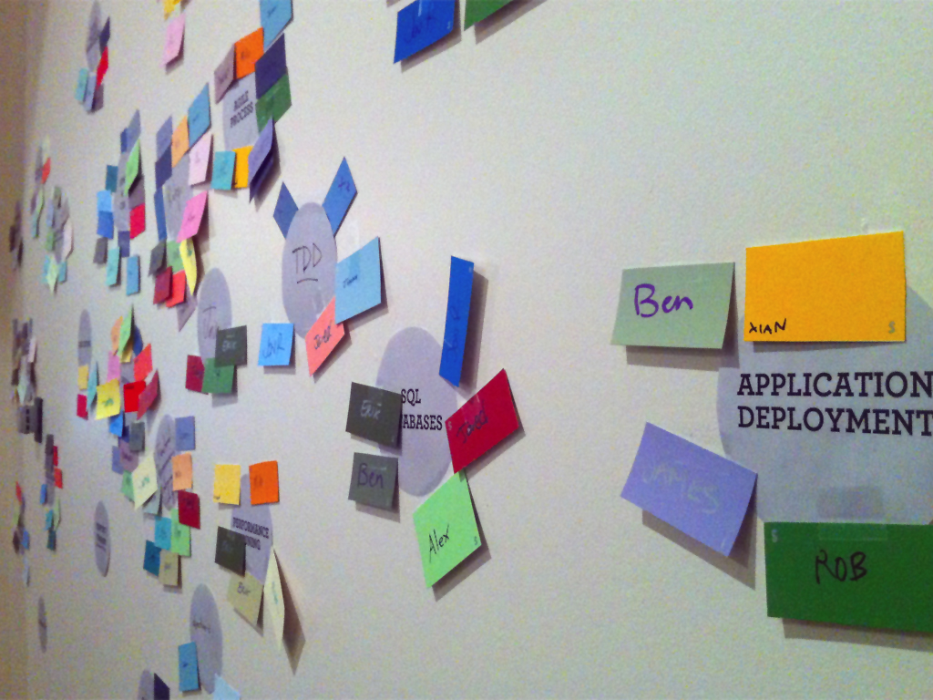
 As Courtney chronicled in the d.build journal, Carbon Five recently engaged in a group exercise to create a physical diagram of our skills and interests. The activity was entertaining and produced a rather attractive artifact on the wall, but we soon realized that (aside from noting that some skills were more popular than others) there was little useful information that could be drawn from the visualization. If we were going to find any kind of message among the splatter of paint chips, we were going to need to reorganize the data.
Our goal was to create a visualization that would focus in on individual and collective patterns in the skills and interests chosen while still inviting people to explore and draw new conclusions. It was important to leave some aspects of the interpretation to the group that created it, so we knew we needed an interactive visualization (the opportunity to explore new HTML5 influenced me here).
The result of this effort (this page requires an HTML5 compatible browser) is a single page canvas application that plots Carbon Fives skills and interests along various axes. In the rest of the article I’ll explain how we converted the data to something more meaningful.
Identifying Meaning
Staring at the wall filled with skill cards and covered with name tags, it was tempting to try to make sense of it all by asking why a certain color seemed to be bunched up in a corner or why others seemed more scattered. The cards were arbitrarily distributed, however, so any abnormalities were the product of statistical fluctuation. If we really wanted to interpret the data as a two dimensional graph, we would have to rearrange the cards in such a way that their position on the on the wall had meaning.
So we began identifying opposing qualities that were applicable to all the skills in varying degrees. In the end, we came up with “‘server side / client side’, ‘technical / creative’, ‘c5 core / c5 expansion’, ‘public facing / in house’, ‘trendy / old school’. We then sat down together and tried to figure out where to place each skill on a scale where, say, ‘public facing’ would be zero and ‘in house’ would be a one. The key to this exercise was to talk about where each skill falls relative to the other skills we’ve already discussed and to keep it quick. I suspect we would get different orderings if we tried again, but the things that are obviously one thing or the other would still migrate towards the ends, and difference in the rest gets averaged out in the calculations anyway.
Once we had multiple orderings for the skills, we had to digitize the location of all the name tags. We did this by assigning a number to each of the skill cards, and then writing down that number in either a skill column or an interest column next to the name of each person who put a name tag on that card. This is close to how the data is represented in the application. It took a couple of passes to get the data right and we had to fill in a few gaps for employees that missed out on the exercise, but eventually I had all the data I needed to create the visualization.
Designing the Visualization

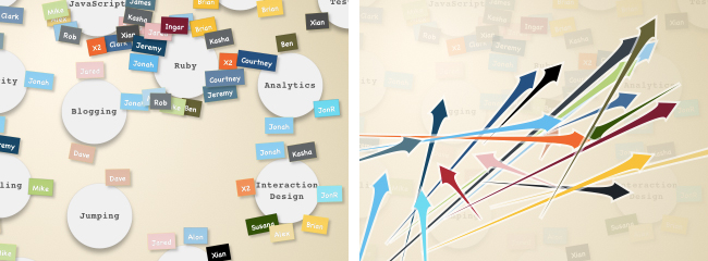
The arrows start at the average location of a person's skills and end at the average location of his or her interests.
The visualization itself is designed to look as much like the the wall as possible, while taking into account the limitations of legibility and vector graphics. When the application starts, it shows all the cards — each with the appropriate name tags — ordered horizontally according to whether the skill is more of a client-side or server-side skill, and vertically by whether the skill is more technical or creative. Clicking the arrows next to the axis labels switches that axis to a new dichotomy and reorders the cards accordingly. This view of the data is mainly to allow you to view the actual data. If you click on the ‘show arrows’ button in the top right, you get a view more conducive to story telling. Each of the arrows represents a Carbon Five employee. The arrow starts at the average location of all of the person’s skills, and points to the average location of all of the person’s interests. In a sense, it’s visualizing the direction of the person’s professional development.
You can also change the axes in the arrows view, and doing so brings up some interesting contrasts. In some combinations, almost all the arrows are pointing in the same direction, and in others they all criss-cross. In most combinations, all the arrows are in a pack, but in some there are a few arrows clustered together but away from the pack. The interpretation of these phenomena depend on the axis in question. The data has inaccuracies and biases built in at every point, but it has still been interesting to spot some feature in the visualization, interpret what it means and then check the names of the people behind the arrows. In most cases the characterization highlights something that is unique about one of the Carbon Five team.
Building Your Own Skill Map
Aside from the choice of skill cards, there is nothing about the exercise or the application that is peculiar to Carbon Five. If you can get your company to generate their own skill map, you can use the source to create your own visualization by changing the data section in the top of the application. In fact, I would be willing to do this for you if you can send me the data in some sort of reasonable digital format (limit the first 5 takers within the next year).
In the next post I will be discussing some of the programming challenges involved in writing interactive canvas applications.
update:
The second post on using transforms effectively in canvas applications is up.
Alex Cruikshank
Alex is Carbon Five's resident mad genius. He is recently very involved in functional languages, and has been anchoring teams at C5 for the past decade.
