
New to Mobile App Design? Six Things to Know for Your Next Mobile Project
At the start of any project, one of the first things to consider is what technology solution the product should be built for. A website? A mobile app? Should it be for iPhone or Android…or both?
As mobile apps lead the charge in user acquisition, the ability for a designer to solve problems for the mobile app experience is becoming more of an essential skill.
If you search “how to design mobile apps” on the web, you’ll find many blog posts cover very high-level concepts…a little too high level.
In this post, I’d like to share the most important things to know and consider when starting your mobile project.
1. Designing for Mobile Apps vs Mobile Web
Native Mobile is more Adaptive than Responsive
As a designer, you’ve probably created your fair share of responsive web experiences, and in doing so accounted for mobile breakpoints and how your layout would reflow or stack using a CSS media query or Flexbox.
Mobile apps are very different; the width and height of elements are set by points. The layout does have the ability to wrap, but not re-stack or re-arrange unless it’s specifically coded to do so for a particular device size….and that can lead to way too much development effort.
There are three key things to uncover at the start of your mobile app project:
- The platform(s) of your target audience (iOS, Android, or both)
- The device size(s) for which you should optimize designs
- Any elements that might need to be optimized for small and large phones
2. Uncovering which platform and device is most common for your audience
iOS? Android? Or Both?
It’s important to ask your client who the target audience will be and what platform(s) they will be on. If your client or team is unsure, looking at data analytics of existing customers or sending out a survey can help inform this. Knowing the platform is crucial, so you can think idiomatically and reference the correct components and naming conventions when it comes time to design. This will also help determine if the project will be coded natively for iOS & Android, or use React Native for deployment for both iOS & Android simultaneously.
For example, if you’re creating an app targeting multiple countries outside of the U.S., Android will most likely be the primary platform. If it’s an app for only U.S. customers, you could have a mix of iOS and Android users with a heavier lean towards iOS.
What device size(s) to optimize for
After you understand the platform(s) customers are on, the next thing to uncover is what device size(s) is most common amongst your audience.
Because native isn’t as responsive as mobile web, an approach I tend to take is to select the device artboard size that’s somewhere in the middle of all my potential options. That is, unless your client or data analytics tell you differently. On a recent project, we knew our target audience would likely not have access to the latest phones and would potentially be running on older systems with slower connections. With that insight, we designed on the smallest Android device artboard size, since most of our audience would experience the app from that perspective.

What happens with smaller devices?
If the device width is smaller than what you’re designing for, the container of the layout will constrain and either wrap or cut elements off.
The iPhone SE (first generation) is currently an outlier because its width & height is significantly smaller than any other popular device out there today. That’s why it’s important to know if your design just needs to look decent on the SE, or if it should also be optimized for it.
If you do need to optimize for SE, create secondary versions of your designs also showing what it looks like on the SE to better predict if you’ll run into elements getting cut off. The good news is that there’s a way to optimize across devices for those scenarios.
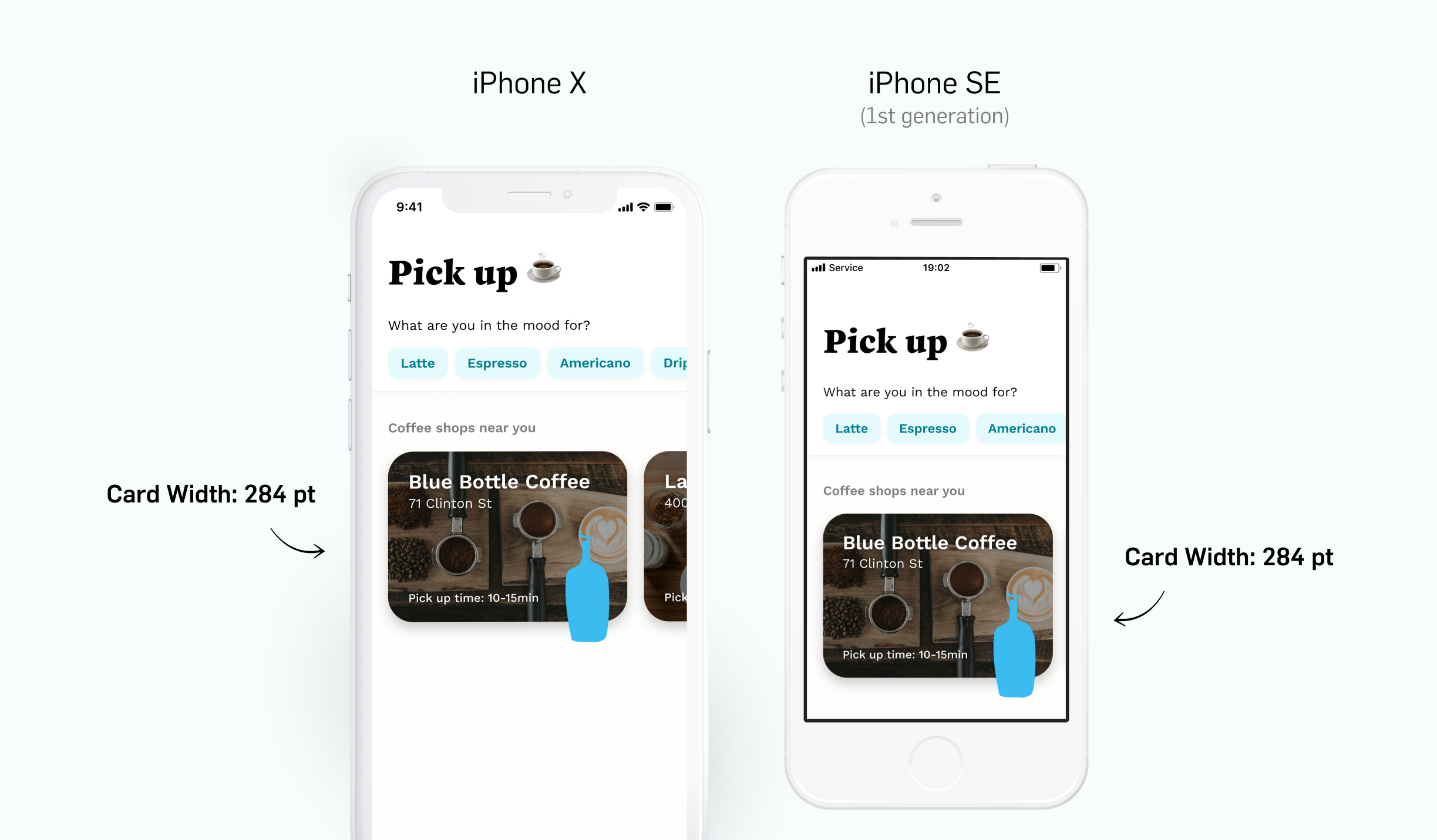
In this example, you can see the card width is set by points. This width allows the other card to show and afford horizontal scrolling for the iPhone X, but for the SE the second card is getting cut off.
How to optimize across devices
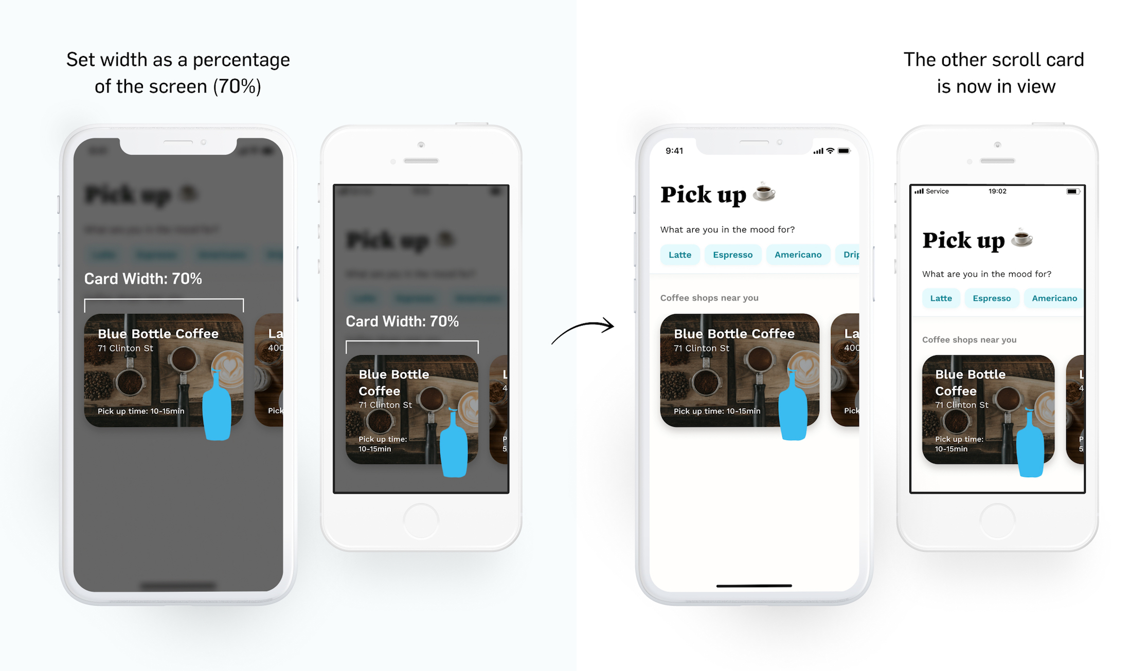
To avoid running into certain elements getting cut off on smaller devices, you can communicate to developers that instead of a static width or height of an element, you can use percentages. This does not have to be for everything, only the things that could cut off or wrap improperly.
For example, you can set the width of a card as a percentage of the screen within a horizontal stack.
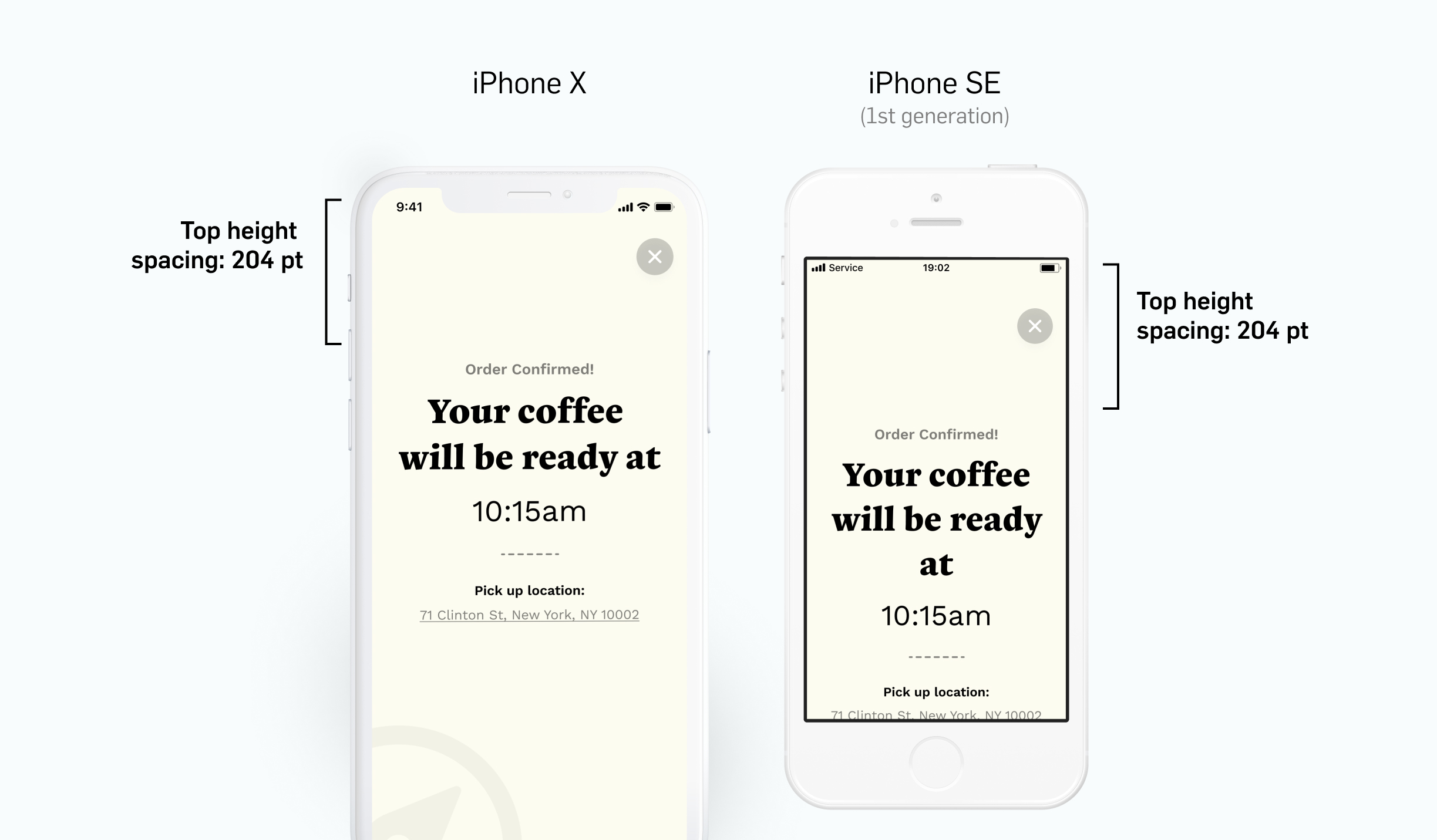
You can also set a height percentage for text placement across devices. In this example, you can see the height in points places the text nicely on the iPhone X, but for the SE the text isn’t fully visible.
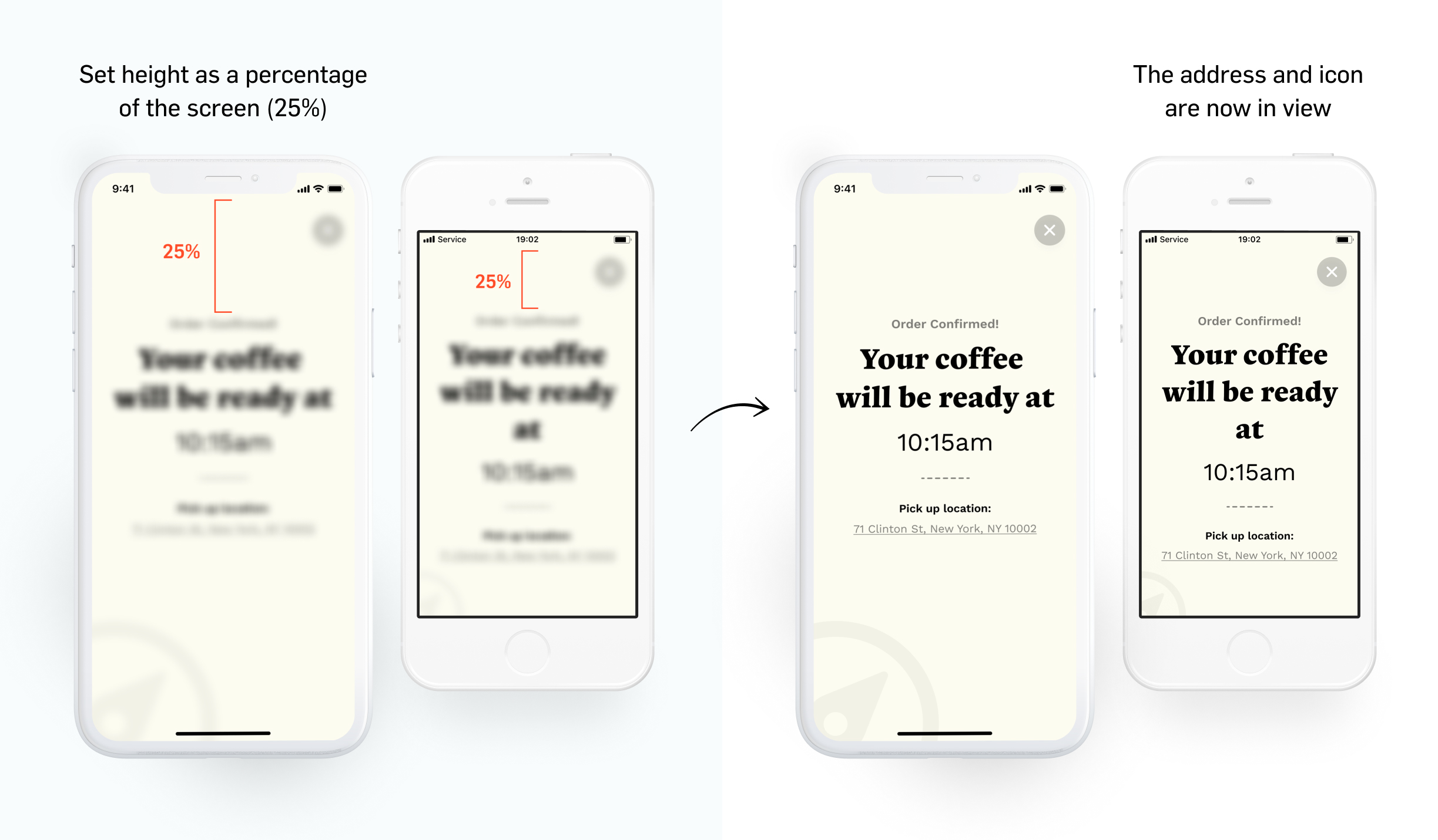
By setting a height percentage, the text can be placed consistently across devices.
You could “guesstimate” a percentage and pair with a developer to see what it’s looking like. If you want to figure out an exact percentage, use this equation:

3. Get familiar with the Platform and its Nomenclature
Speaking the same language as your developer is incredibly important to avoid any confusion on implementation and can help speed up communication loops.
What to know about iOS
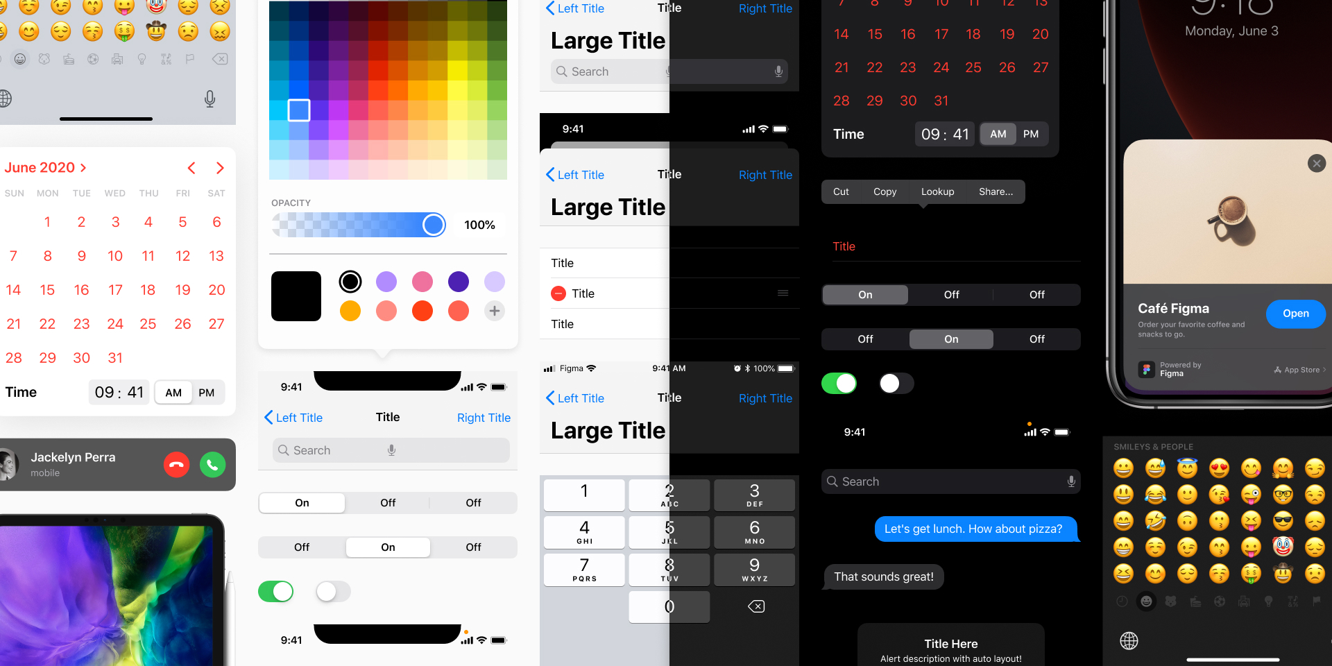
iOS uses the Human Interface Guidelines to convey different components and principles of the iOS experience. However, it can be very high level for designers in that screenshot examples of all the possible states aren’t shown. The documentation provides links for more details but it is explained through Swift code.
A good way to be more informed with the iOS platform is to look at GUI files of iOS 13 & iOS 14 to reference what components are called. I would also recommend watching specifically the design or developer videos from the WWDC Developer site or Apple Developer mobile app which gives a detailed breakdown of what’s possible within a component and how developers name and reference elements in their code. iOS has a much smaller number of components to work with versus it’s Android counterpart, but it’s definitely enough for an app.
By @joey: https://www.figma.com/@joey
What to know about Android
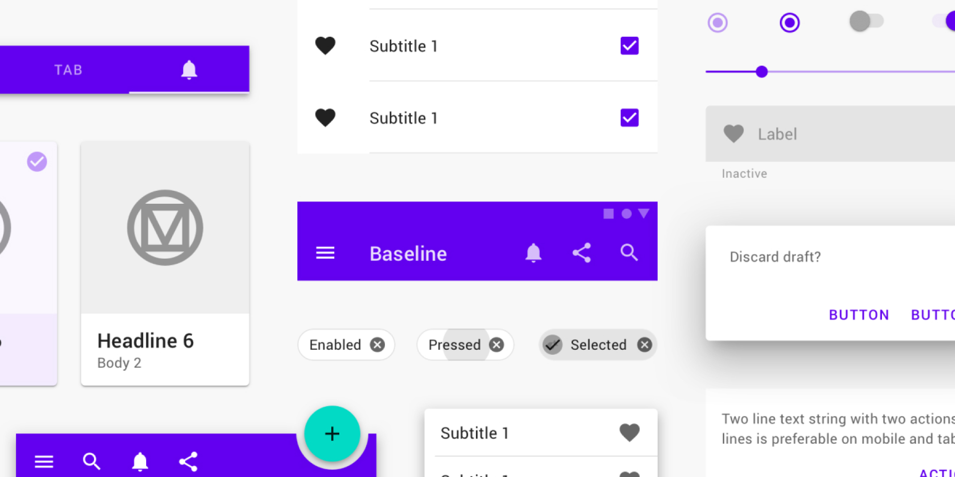
Android uses Material Design and it is documented very well for referencing naming conventions and also seeing the possible states of components you want to leverage. I would also recommend looking at Material Design GUI files to get a high-level view of what you have to work with.
By @MaterialDesign: https://www.figma.com/@materialdesign
What to know about React Native
React Native is interesting mainly for the fact that it’s based in Javascript and CSS to deploy both Android and iOS apps simultaneously. It’s awesome for smaller teams to get an app on both platforms out the door, but it also comes with different “rules”.
Three aspects you should know when designing for React Native:
Because there is one path for both platforms, React Native components could either look the same on both iOS and Android or take on the platform default view. It’s a bit of a toss-up depending on how it gets implemented so having flexibility for what the designs will end up looking like on the device is important.
4. Leverage what you get for “free”
After seeing what you have to work with from iOS, Android, and React Native, it’s important to leverage the platform components you get for “free” as much as possible. This will reduce development time and help the product get to market quicker with a focus on building core features.
Top components to leverage
iOS: HIG Guidelines
- Navigation Bars: Standard & Large Title
- Tab Bar
- Tool bar
- Search bar
- Button Control Types:
- Rounded Rectangle
- Small buttons
- Small action controls (Circular icons)
- Pickers:
- Selection
- Date & Time (updated in iOS14)
- Segmented Controls
- Alert Dialogs
- Pull down menus (new in iOS14)
- Switches
- Action Sheets
- Table Views (Lists)
Android: Material Design
- Top App Bars: Standard & Extended
- Bottom Navigation
- Buttons
- FAB (Floating action button)
- Chips
- Dialogs
- Selection Controls:
- Checkbox
- Radio
- Switch
- Tabs: Fixed & Scrollable
- Text Fields
- Navigation Drawer
- Snackbars
React Native:
- Activity Indicator (Loader)
- Buttons
- Modal
- Switch
- Text Input
- Pull to refresh
- Alert Dialogs
- Full Screen Modals (Modal Stack)
- Tabs
- Icon badges
- Drawers
- Screen transitions
- Animations
Expo in “Managed” mode:
- Date & Time Picker
- Access to Calendar
- Access to Contacts
- Google Sign in
- Face/Touch ID
- Map View
- Push & Local notifications
- Share sheets
- Splash Screen
What you should know about Expo for React Native
Expo is a framework for universal React applications. It’s a set of tools built around React Native and native platforms to develop, build, and deploy apps quickly. It’s great in the sense that you get a good amount of components/functionality for free.
There are two modes in Expo, “Bare” and “Managed”. You’ll likely start the project in “Managed” mode which allows you to have access to many Expo services, but at some point, the developers will have to “Eject” into “Bare” mode where implementation becomes more core to iOS & Android. In “Bare” mode, certain Expo items aren’t available to implement. All that to say you’ll probably have these discussions with your developers and it’s really a matter of knowing what mode the app is in and when Expo functionality can be leveraged or not.
What you can alter with “free” components
Your app will have branding and visuals that don’t really align with the default component design. There are four attributes you will be able to alter with free components to align with your overall visual and brand:
- Typeface (can change within the system’s Theming)
- Text Size (can change within the system’s Theming)
- Text Color
- Background or Element Color

What if I need something more custom?
It’s very likely that the platform won’t have everything you need out of the box, and custom components will be necessary. Make sure the things that are custom are what you definitely need. Anything custom for iOS or Android takes more time to build. If something is custom, make that clear to developers so they can estimate their stories accurately.
5. Keep Navigation in mind
The most common and successful navigation pattern to use across iOS, Android, and React Native is the tab bar. Tab bars accompanied with navigation bars and a defined screen transition pattern will easily allow your users to accomplish any task.
Using the Tab Bar
Tab bars make it easy for users to navigate around the app no matter where they are. Typically tab bars have 3-5 items that can hold the functionality and content of your app. The items within the tab bar could have icons + titles, only icons, or only titles.

There’s a common question that comes up, “Should the tab bar persist everywhere in the app?” There’s no right or wrong answer; it usually persists for the majority of the app, but there can be scenarios or flows where it’s not as important for users to navigate to different areas in the app.
The best way to know is to prototype it for yourself and “feel” out what approach is best. Apple HIG recommends tab bars persist everywhere, but I’ve found there are certain scenarios where the content and flow take more priority.
For Example: If a user has entered a booking or checkout flow, the tab bar might not be necessary to show on the screen. In this case, it could be better to take full advantage of the screen real estate and have the flow be more directed so users can complete their task.
What to know about Navigation Bars
Navigation bars help users see where they are, provides a way to go back to the previous screen, and also allows users to take secondary actions.

There are a few flavors of navigation bars depending on what platform you’re on. iOS and Android have standard or extended versions where the title is bigger and looks like it’s a part of the content until you scroll. Below you can see different navigation bars you get with the platform, as well as the different elements that can accompany them.
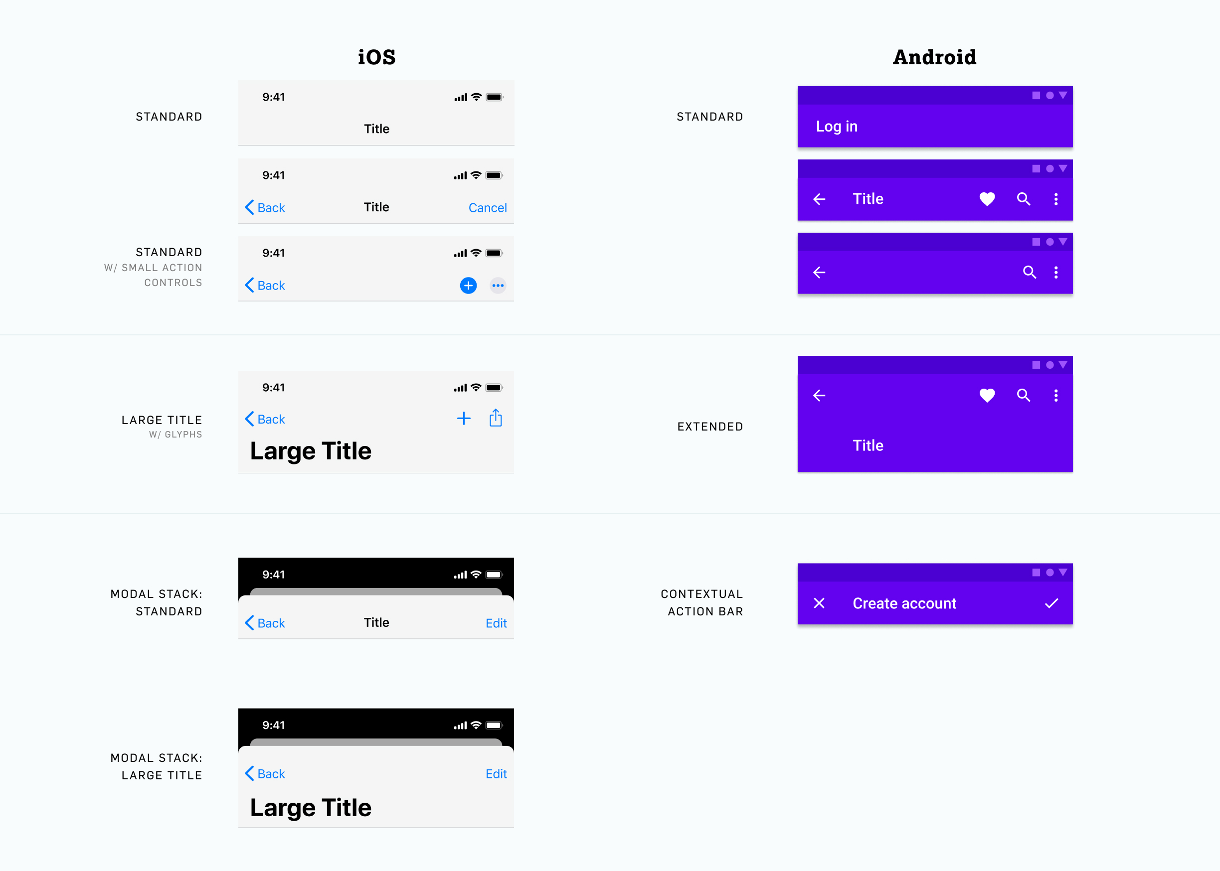
One thing I’ve found is that the Back button doesn’t have to be paired with text such as “Back” or the previous name of the screen. That’s your call and something to discuss with your developers. Many apps have gone with the more minimal route of only showing the back icon simply because it’s a pattern that’s very known.
What to know about Screen Transitions
There are two types of screen transitions you should communicate to your developers when a new screen comes in. The “Push” Transition (sliding in from the right) and the “Modal” Transition (sliding in from the bottom). Defining these transitions for your team will help eliminate any confusion for how screens should enter.
Any screen that progresses sequentially would likely get the “Push” Transition. Any new flow, action, or confirmation could have the “Modal” Transition.
“Push” Transition
“Modal” Transition
A screen that has a “Modal” Transition could also have sequential screens within it. Those sequential screens could get the “Push” Transition all within the Modal Stack. This is common for flows in iOS that use the “Modal” Transition.
If you want to get fancy, a “Shared Element” Transition will take an element and carry it over into the next screen.
“Shared Element” Transition
6. Final Tips
Make prototyping apart of your process
Finding the screen transitions that work best for your app experience is hard to see when static screens are side by side in a file. I recommend prototyping the screen transitions of your flows so you can validate what’s best for the experience and communicate this to your development team. These prototypes also come in handy when it comes time to test with users.
Stay inspired
The great thing about mobile apps is that we are all mobile app users. Whenever you’re accomplishing a task or browsing in an app, try to pay attention to the interactions, navigation, and visual patterns within it. Take screenshots and screen record what you see that’s working well. There’s a lot of inspiration out there, keep an eye out for inspiration to influence your next mobile project.
Other inspiration resources:
- Uplabs
- Panda Chrome Extension Plug in
- Pinterest (Search: “Mobile app design”)
- Dribbble
- Instagram:
- @myinterface
- @ui.designs
- @twineuidesign
- @ui.ux_design_inspiration
- @design.bot
Interested in more design tips & insights? Visit the design section on our blog!