
Designing for Engagement
One of the most interesting distinctions we make in design is between service design and engagement design. Service design is oriented around helping someone achieve a task. The interface that asks for information and prints your boarding pass is service design – it’s successful if you get through it without mistakes as quickly as possible. On the other hand, Engagement design is oriented around keeping people’s attention. If you’re binging a TV show, scrolling down a news feed, or liking your friend’s posts, you’re in an environment designed for engagement.
Designing for engagement means offering up lots and lots of content to keep people interested. A key performance metric for engagement design may be how many posts a user reads, or how many videos they go through without returning to the homepage or search. The end goal of both business and user is a steady flow of content that keeps a user’s attention.
A word about content driven business models
Sites that use content (user generated or otherwise) to keep their users engaged have traditionally struggled to find revenue models outside of advertising. Some sites, like Netflix, the Wall Street Journal and others gate their content and offer a subscription model, but a vast majority make revenue with ads. How content sites advertise has changed a great deal in recent years – it’s not just popup and banner ads anymore – but the evolution of advertising is out of scope for this post. Long story short, the best way to monetize an engagement-driven site depends on what kind of content you’re offering and how much control you have over it.
So what kind of content are we offering?
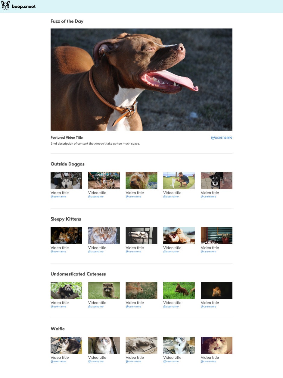
Today, we’re going to look at the design principles of engagement using an imaginary site for videos of cute animals. (Openpuppies.com was a big inspiration.)
Choice, but not too much
Let’s assume you’ve already done some user research and you’re coming to this phase of design with a clear understanding of what content your viewers expect to see.
With that data, we can build the information architecture of our site. We want to offer our viewers a path through the site that maps to their mental models of the content. Ideally, viewers will browse the site and find what they were expecting in the first place they look. Giving our viewers a choice early in the experience can help us immensely when it comes time to recommend next steps for them.
Our target viewers go look at cute animals when they’re having a tough day, and want to escape as fast as they can. That’s why we’re leading with a recommended video – viewers who aren’t particular about categories can watch something right away.
We’ve also got some more specific viewer behaviors for our cute animal video player. Some viewers are only looking for cat videos. Others are looking for only dog videos, or exotic animals, or baby animals. For this site, we’ll create a few playlists of most popular categories to give viewers a place to start from. Once we understand what people are hoping to see, we can set them down clearly defined paths.
Dog icon by julian roman from the Noun Project
Why not just put it in a feed?
A newsfeed is a great design pattern for when users have already self-selected the content or users they’re interested in. A constant stream of new information from friends and famous people is a reliable way to keep a viewer’s attention, but creating a login and asking viewers to curate a feed is asking a lot of their time.
Present your content right
Different types of content lead with different types of text and imagery. A site like The New York Times is focused on getting people to read text articles, so its front page is mostly text-based. A celebrity news site might rely more on grabby headlines and dramatic pictures. YouTube celebrities have made an art out of crafting thumbnails with exaggerated facial expressions and bright colors. Whether it’s formally sound design or not, all of these presentation formats help viewers evaluate the content they’re about to see.
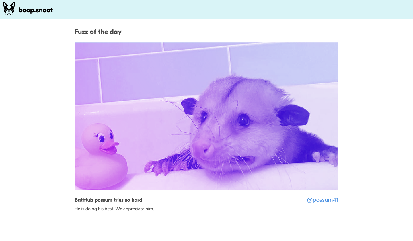
For a site full of cute animals, a title or headline doesn’t matter nearly as much as the animals themselves. Viewers are making decisions on what to watch based on which video looks the cutest. When we’re designing our content display, we’ll deprioritize the username, description, number of views, and date posted and assume that our viewers are going to evaluate mostly on the thumbnail image.
Dog icon by julian roman from the Noun Project
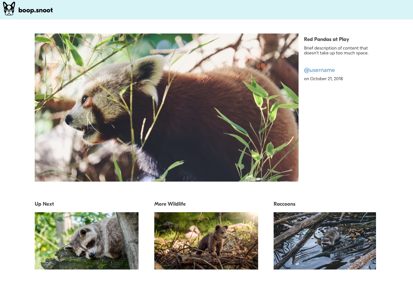
Paths of least resistance
Now once the viewer has watched their first video, which narrowed down the choice funnel, it’s time to show them the next video. When they’ve signaled that they’re ready to see something new (by pausing the video, scrolling down the page, or reaching the end) it’s time to make a few recommendations about what can come next.
The user’s path of least resistance is a linear recommendation system. An
autoplay feature on a video player or stream (see the way The Outline loads up a new item in full when you reach the bottom of the article you’re reading) keeps you locked in a flow by more or less faking a feed. This removes a lot of choice exhaustion from the viewer, which can be a strength! Whether a linear recommendation system is right for your product depends on the duration of the content and browsing habits of your target audience.
It’s important not to overdo it on recommendations, and to try to make them contextual to the video being played. If your viewers have to make an active choice every time, they’ll lose engagement and start looking for other ways to kill time on the internet.
Dog icon by julian roman from the Noun Project
Really though, content comes first
Ultimately the design for a content site is about information hierarchy and letting the content tell the story – not about branding. The more content available on the site, the more the site design is going to need to take a backseat and let the content tell its story. Fussy details around the brand are going to make it harder for folks to find the thing that’s going to keep them on your website.
Look at Instagram, which started minimalist and has only grown more minimalist as people learn how to use it (and as it adds more features that might distract you from the almighty feed) Again, watch users for cues and make sure your brand-enforcing pieces are coming at a point when some loyalty has been developed and they’re okay with being interrupted.
Finally, if you are trying to establish a strong brand presence, you can dial it up around marketing and more experiential elements outside of the content mainlining experience, and scale it back when it comes time to let other content take the spotlight. Look at Mailchimp’s web presence vs their product for an example of how it works.
In conclusion
Keeping your viewers on any one site is hard. It’s a big internet out there and content is being constantly uploaded to distract and entertain us. Thoughtful decisions about information architecture and well-paced (not too aggressive!) recommendations can help your viewers find what they’re looking for in a sea of noise. Good luck, and may your viewers be as fascinated by your content as this dog is by his birthday cake: